
Talbott & Sons (2021)
Ecommerce visual design and brand identity.
LEATHER GOODS ECOMMERCE WEBSITE
Summary
This case study focuses on visual design and branding skills.
In 2014 I started an ecommerce company selling custom-made leather camera straps. Last year I decided it was time to rebrand the company. My goals were to continue to appeal to my current customers while also tapping into a new market. To accomplish this I researched my competitors and target users. I analyzed my findings and focused in on the core attributes my prospective customers demand. These attributes would inform the logo and branding re-design.
Role
Visual Designer
Brand Strategist
Team
Myself
Introduction
Business + Experience Goals
Talbott & Sons is an ecommerce business that specializes in custom-made leather camera straps. Since its inception 7 years ago, the company’s goal has been to appeal to photographers’ demand for vintage-inspired camera accessories to match their film cameras from the 60s and 70s.
Changing Market
Camera companies also recognized the demand for a vintage aesthetic and began to produce new vintage-inspired cameras like the FujiFilm X and Leica M series. Talbott & Sons is interested in creating new branding and products that compliment these contemporary throw-backs.
Re-brand Goal
The goal of this re-brand project was to expand Talbott & Sons’ market by appealing to new customers. To accomplish this I dug into what photographers want and why. Then I created a brand identity that communicates the qualities that they demand.
Process
Starting at a high-level view I built up to higher and higher fidelity. I created a series of logical decisions so that there are no surprises for the client and we arrive at a common place.
Process
Research
User Persona
Competitive Analysis
Analysis
Brand Attributes
Design
Logo Design
Brand Guidelines
User Personas
Getting acquainted with users
I reached out to current and prospective customers to pick their brains about what they admire, appreciate, and engage with (what I want to emulate) and things to stay far away from.
Personas
I used this information to create 3 distinct personas which I used to inform design decisions throughout the brand and logo development. There were many times that looking back at personas helped me correct course when branding was starting to drift in the wrong direction.
Competitive Analysis
Who I want to replace
I researched who my direct and indirect competitors are and what they’re doing with their logo, branding, website, and social media. This would be my benchmark, inspiration, and motivation to outdo them in every aspect.
Core Brand Attributes
Defining who we are
The core brand attributes are the result of an exercise where the client and I brainstorm words that describe the company and customers. I focused on words that have strong visual associations. Three words stood out as good representatives for Talbott and Sons’ brand: Luxury, Artisanal, and Adventurous. These three words would act as a filter for all of the following design decisions.
Mood Board
Compiling reference images
The mood board was inspired by the core brand attributes. I used the three key words; Luxury, Artisanal, and Adventurous, to search for images using popular stock photography websites. That’s why it was important to think of words that have strong visual associations. I compiled images that represent trends in popular culture and the culture of the user personas.
Color Palette
Communicating with color
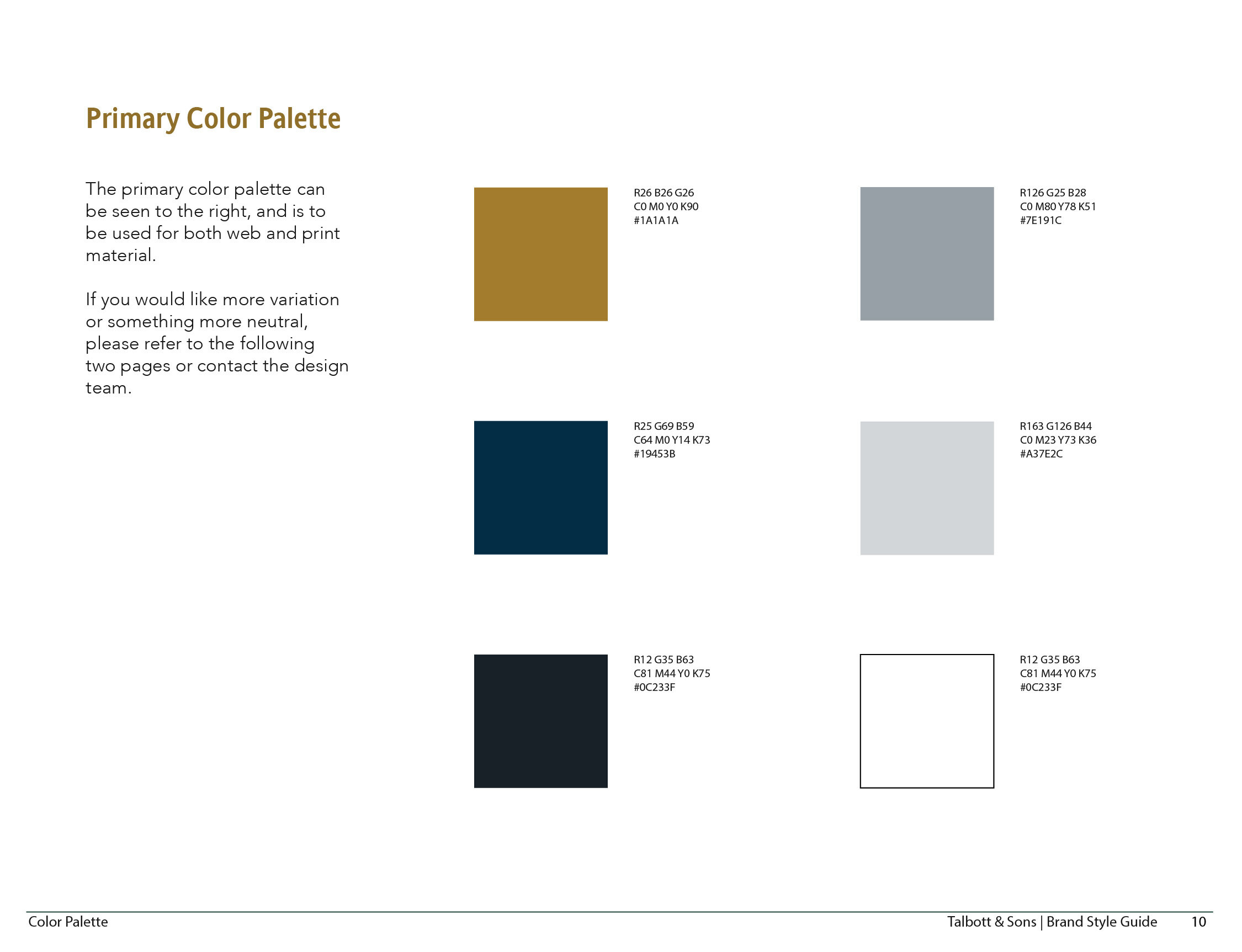
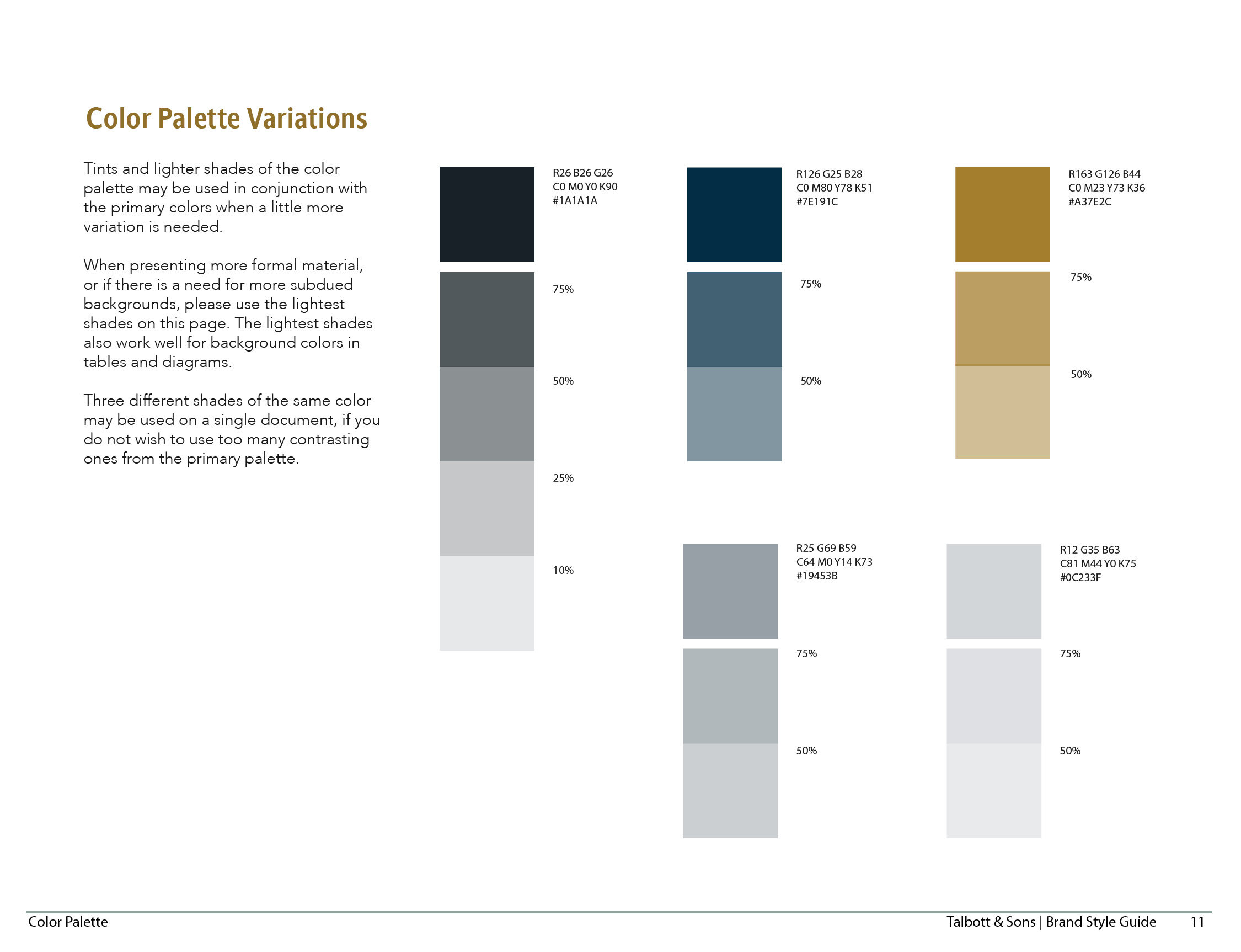
I chose colors that would help communicate the core brand attributes to customers through psychological associations. For Luxury I chose gold which has strong associations with wealth, tradition, and value. For Artisanal I chose navy blue which is associated with reliability and trustworthiness. Then I used an image from the mood board that personifies travel and adventure to extract the color palette.
Logo Design
Research
I researched designer brand logos because I want people to associate Talbott & Sons with Luxury - one of the 3 core brand attributes. I compared a lot of logos and identified some trends in their anatomy. Most of the logos have a classic font for their logotype, an icon above the logotype, and a tagline with the business’ location or establishment year below the logotype.
Sketching
I started designing the logo by sketching on paper before I moved to the computer. I wanted to quickly try a lot of different options; playing with letterforms for the custom monogram and figuring out the hierarchy of where elements go. Hand-sketches tend to elicit more honest feedback than digital designs from clients because they don’t seem finished or like you’ve spent a lot of time on them.
Final design
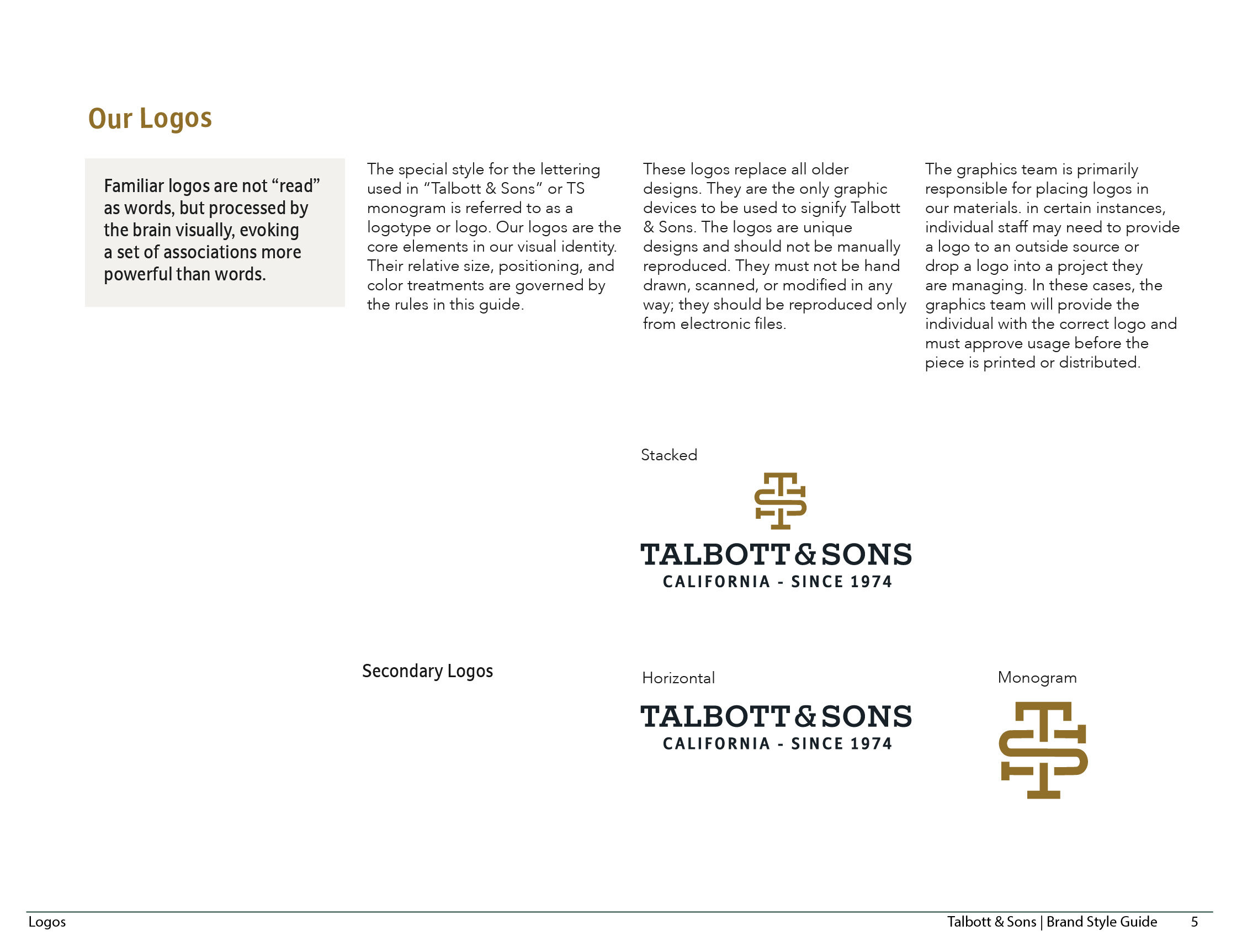
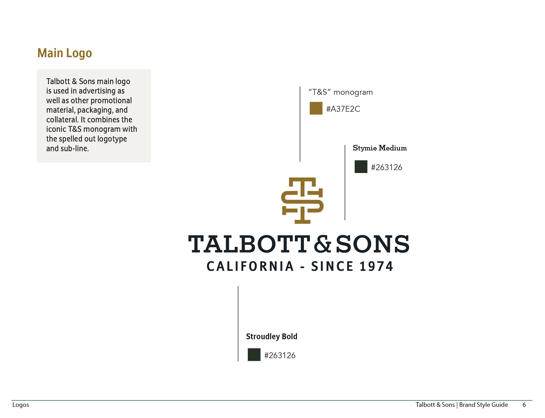
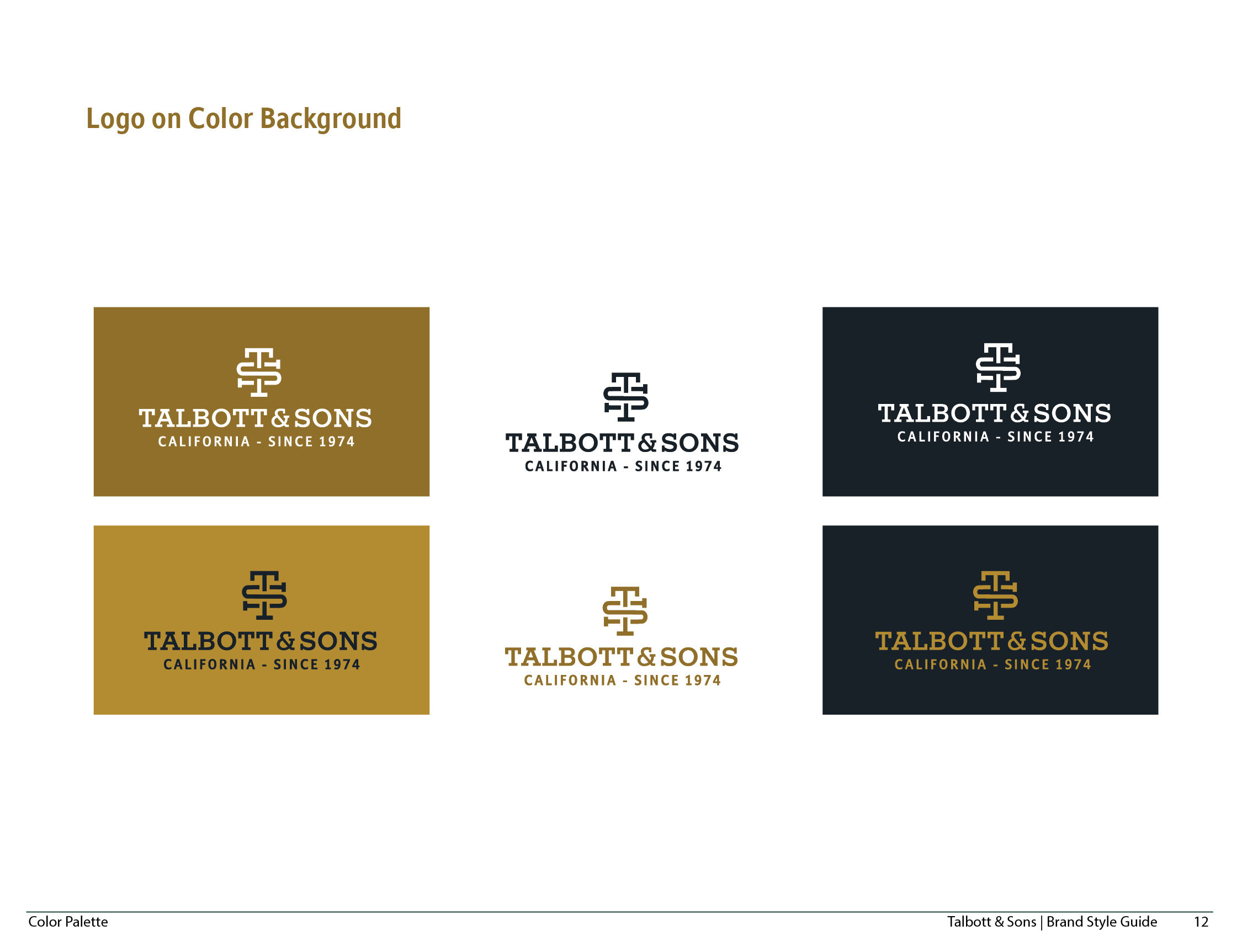
The new logo conveys authenticity visually instead of explicitly stating it. The logotype uses a strong slab-serif font that communicates strength and tradition. The monogram icon is associated with fashion companies which communicates luxury. The tagline capitalizes on peoples’ associations with the location, and the establishment date communicates experience and trustworthiness.
Stylescape
Telling a design story
I created a stylescape bringing together all of the individual aesthetic elements to tell a design story about the brand. I started with the hero image and worked backward including the identity, fonts, colors, imagery, and content layout. Three different stylescapes would be shared with the client to elicit feedback about the design direction. The successful elements from each 3 stylescapes would be combined to produce the final brand identity.
Brand Guidelines
Brand elements and usage
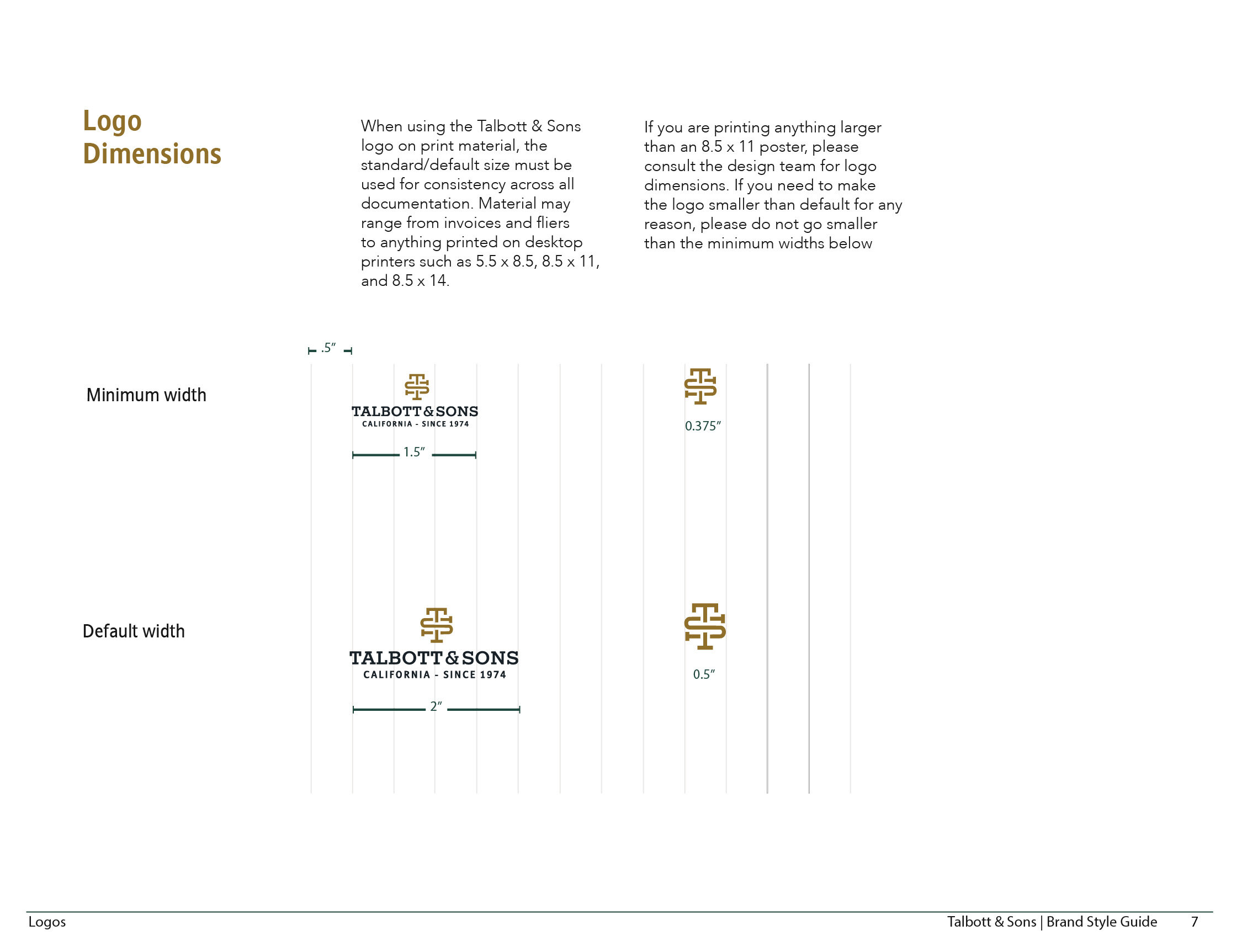
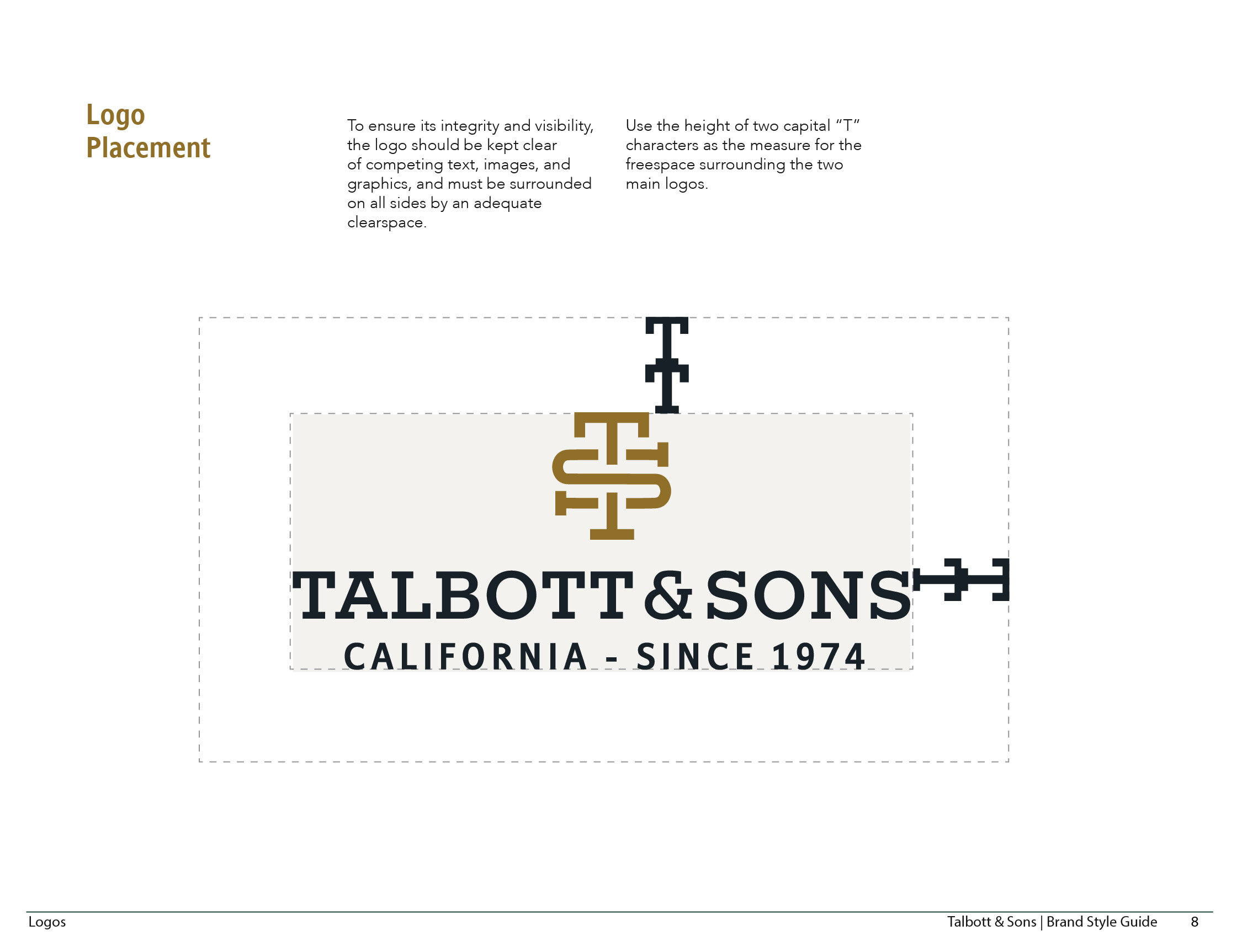
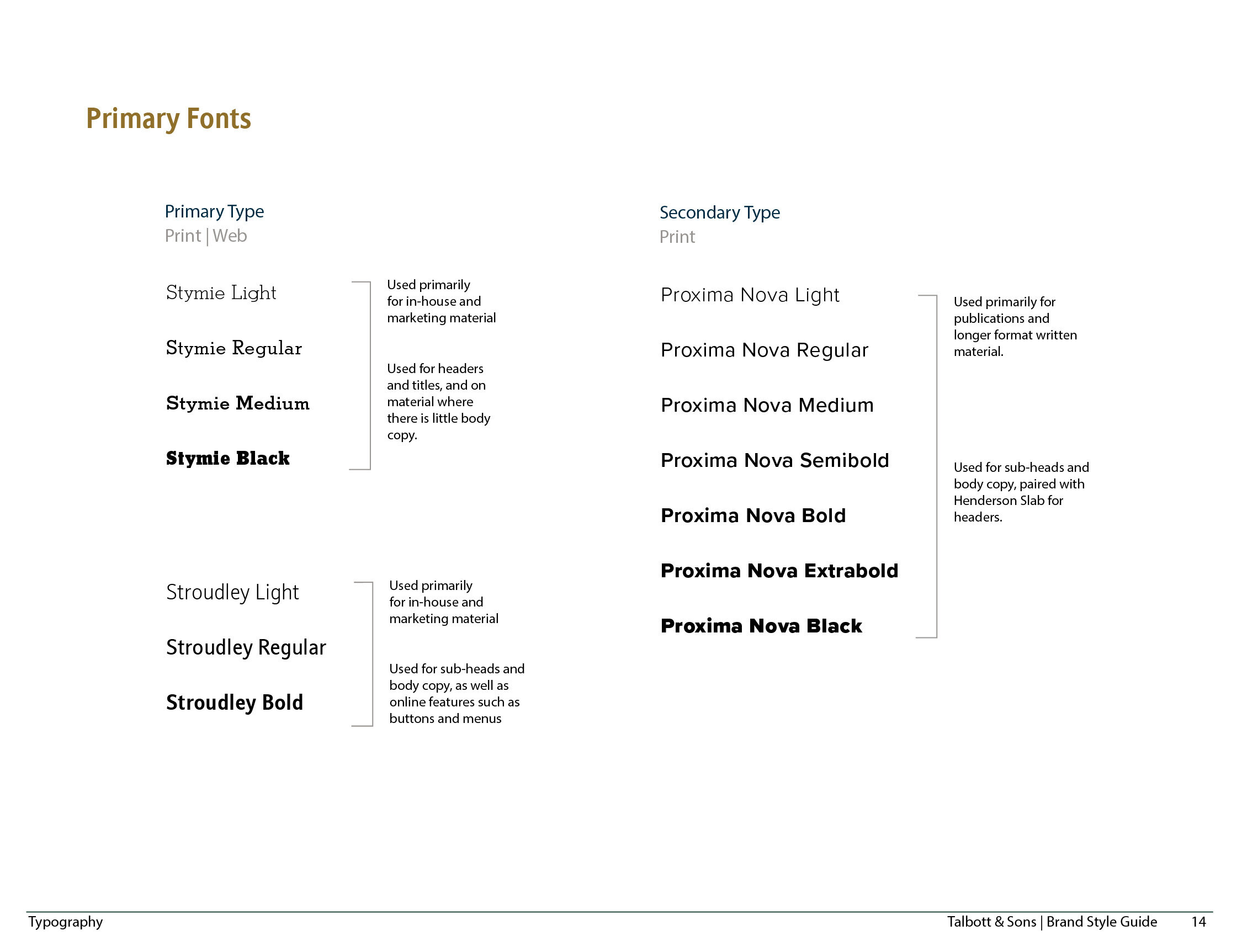
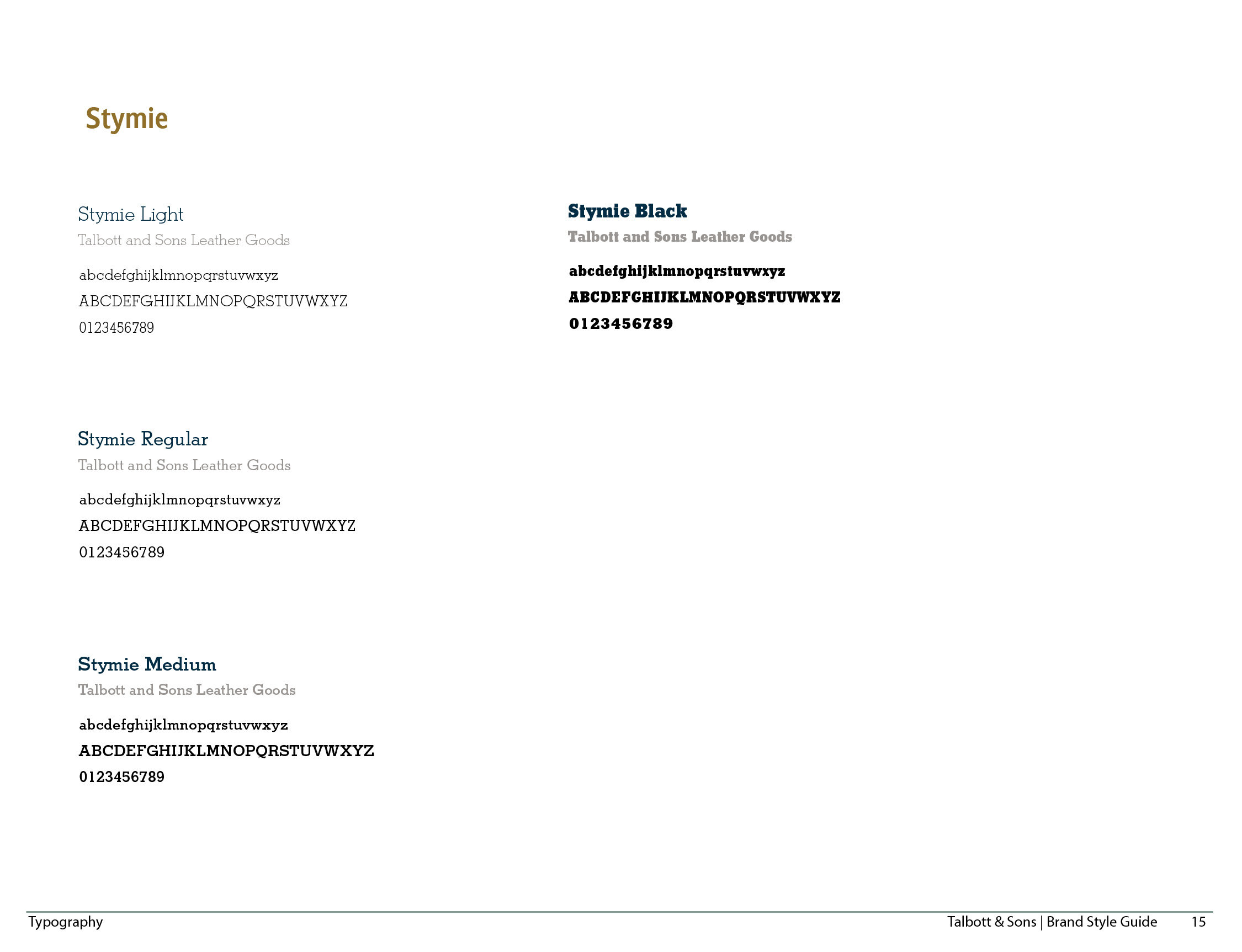
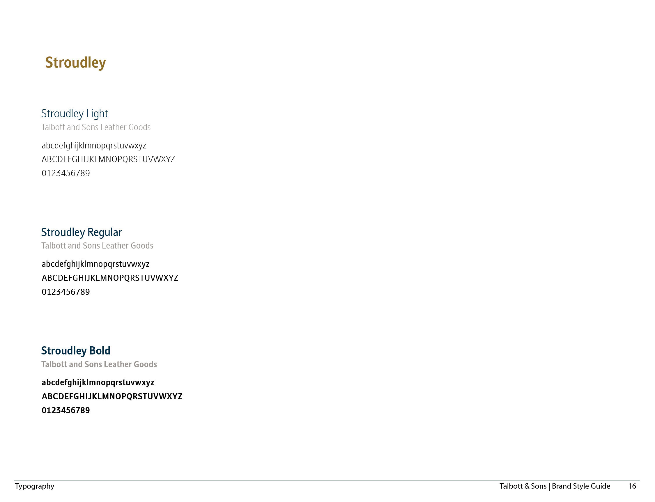
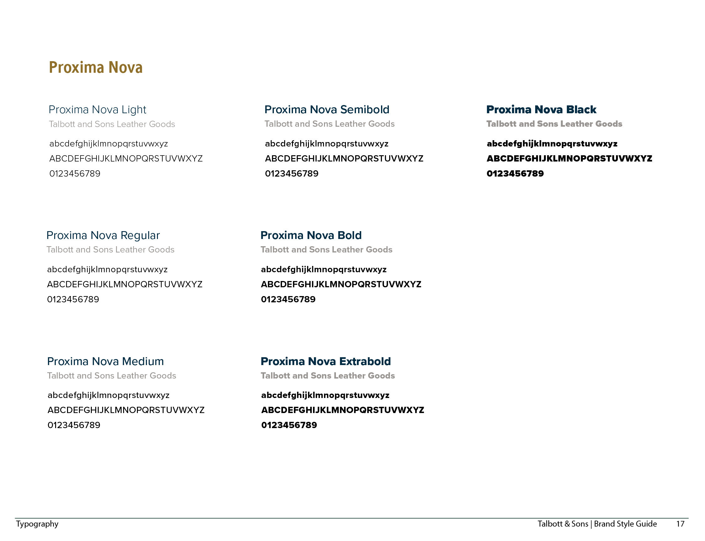
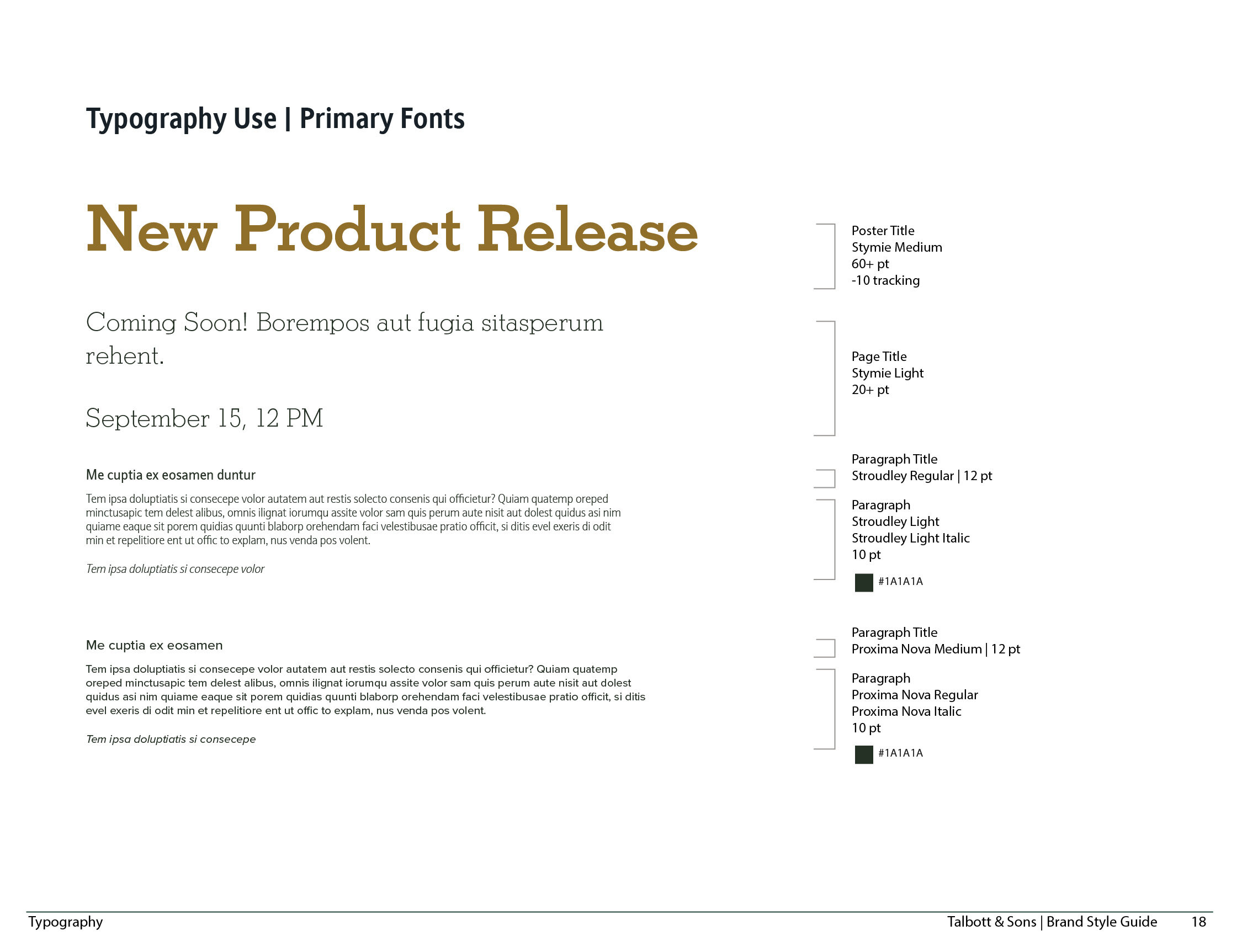
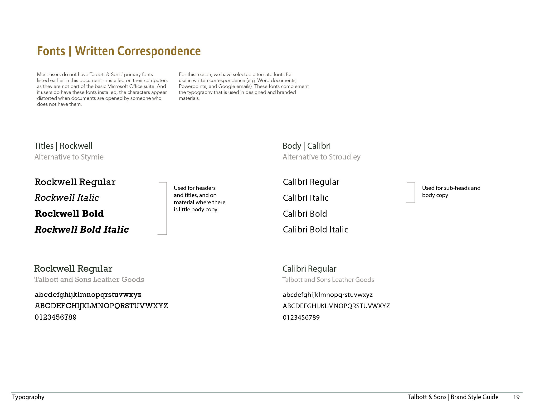
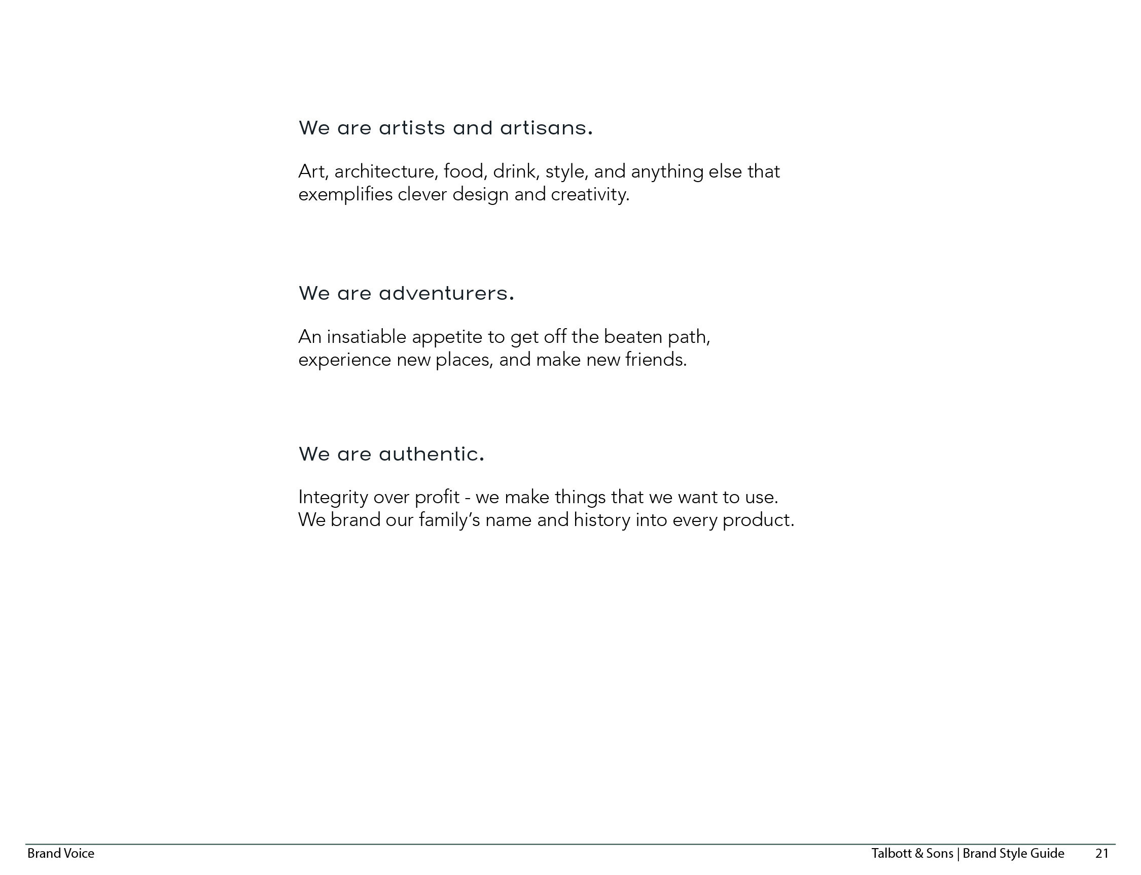
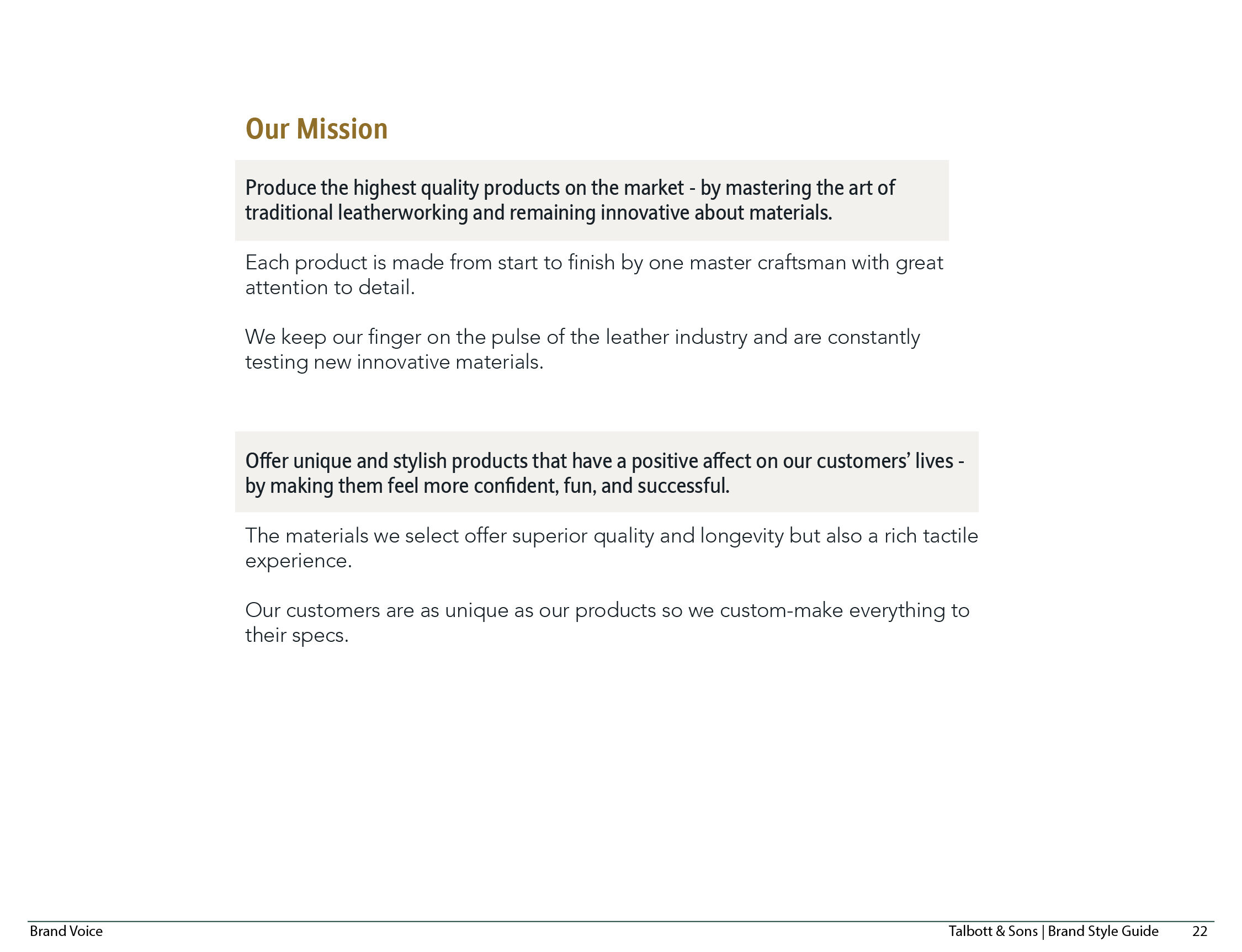
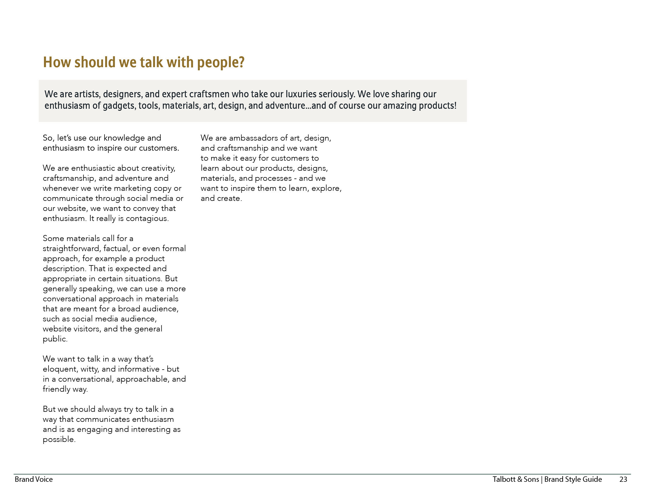
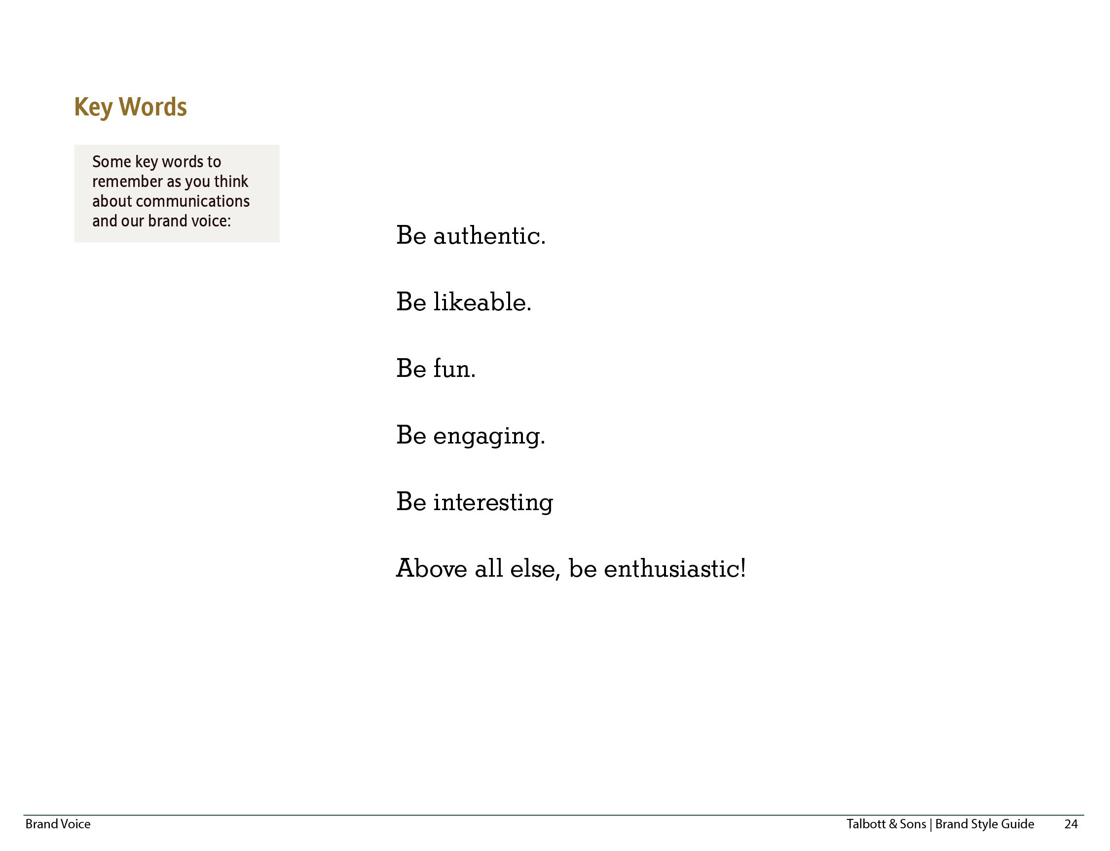
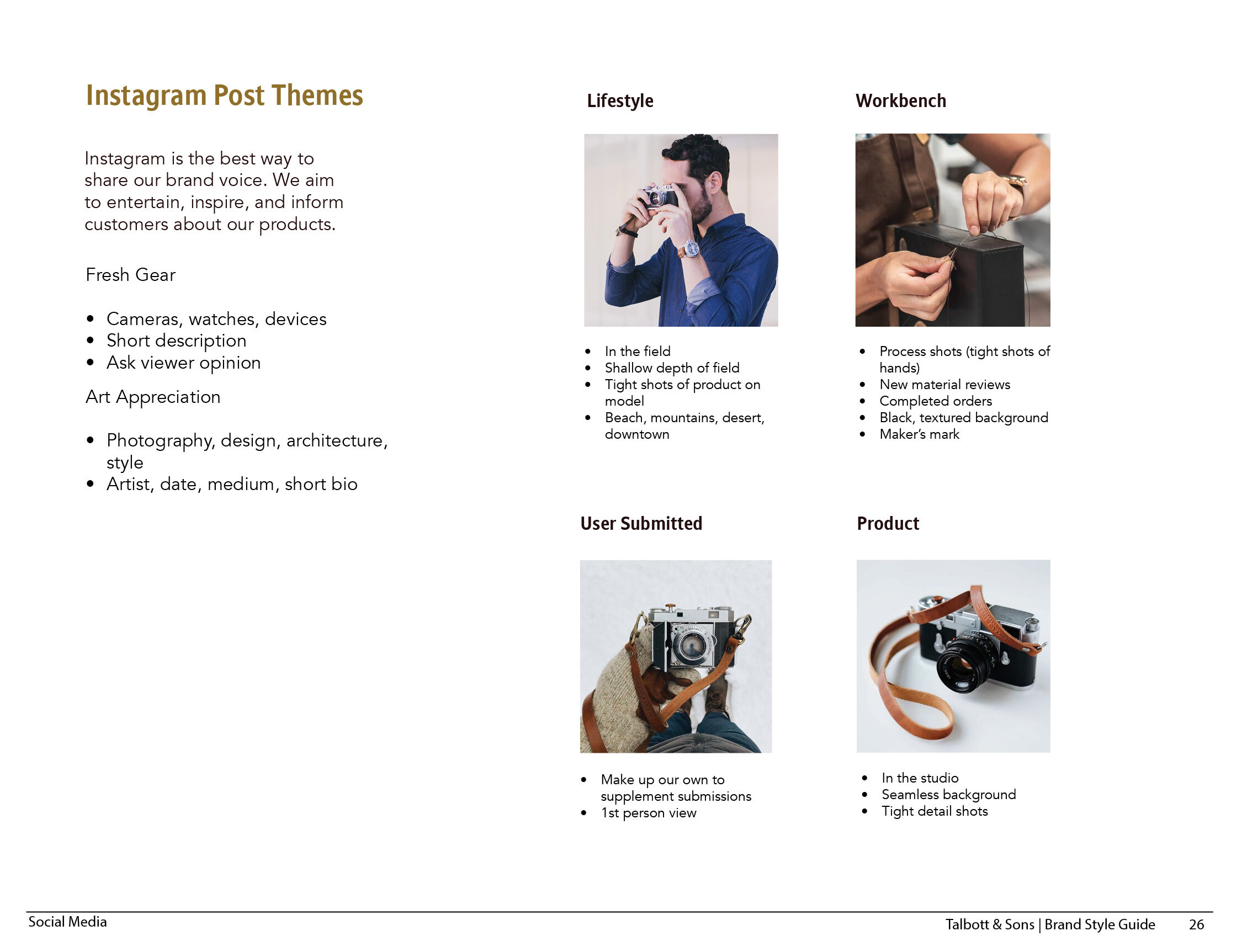
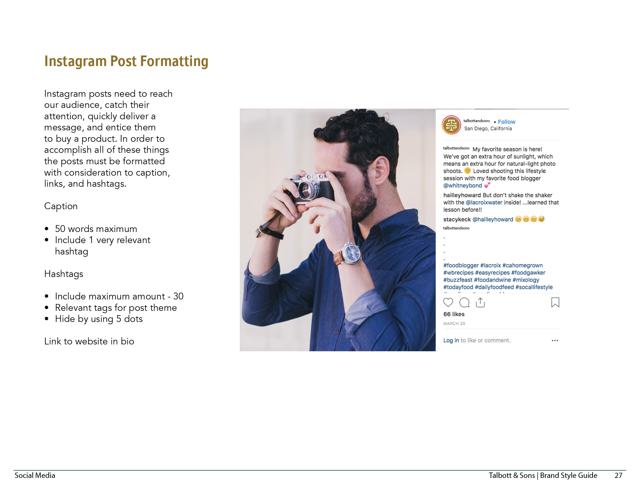
I detailed many elements of the brand and their usage in a brand guidelines document. This document could be handed off to any designer and referenced when applying the brand to graphics, website, social, packaging, product, customer experience and messaging. By using standard branding Talbott & Sons can enhance the customer experience through visual repetition and consistency as well as build upon the company’s reputation for quality.




Conclusion
A process focused on users
Working with clients poses challenges but having a process that follows a series of logical decisions helps the client and I arrive at a common place. Sharing early and often, building up from a high-level view to higher and higher fidelity, keeps the client involved and eliminates surprises.
The design process that I followed, which is intended to keep clients involved and avoid surprises, also helped me stay focused on what my customers want. I didn’t sit down and design the branding that I like. Instead, exercises like personas and brand attributes produced deliverables that could be referred back to, helping me correct course when design decisions started to drift off track.

View next case study
TUSIMPLE

